Color is not just a mere aesthetic choice—it’s a powerful tool that can influence mood, behavior, and even well-being. When it comes to decorating your home, selecting the right color palette is crucial not only for creating a visually appealing space but also for fostering the desired emotions and atmosphere. Let’s explore how you can harness the psychology of color to make informed choices for your home’s palette.
Understanding Color Psychology
Colors and Their Emotional Impact
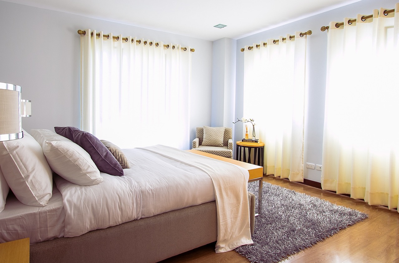
Each color can evoke different feelings and reactions. For instance, blues are often seen as calming and stabilizing, making them perfect for bedrooms or offices where you need to relax or concentrate. Reds are vibrant and energizing, ideal for spaces where you want to stimulate conversation and excitement, like dining rooms. Understanding the emotional impact of colors can help you decide where they might be most effective in your home.
Creating Your Color Scheme
Start with the Mood You Want to Set
Before picking up paint swatches, consider the mood you want to create in each room. Do you want your living room to feel soothing or invigorating? Would you prefer your kitchen to energize you or provide a serene spot to cook? Answering these questions can guide your color choices effectively. For instance, a calming lavender might be perfect for a relaxing reading nook, while a cheerful yellow could make a kitchen feel warm and welcoming.
Balancing Colors
Mix and Match with Confidence
While it’s important to choose colors that align with the desired emotions for each room, balance is key. Too much of one color can be overwhelming. Incorporate neutral tones like whites, greys, or beiges to balance out more intense colors, or use them as a base to allow your chosen colors to truly pop. You can also use complementary colors (those directly opposite each other on the color wheel) to create a vibrant and dynamic look.
Consider Lighting
Natural and Artificial Light Influence
Lighting plays a pivotal role in how colors look in a space. Natural light shows the truest color, while incandescent lighting can bring out warm tones, and fluorescent lighting can cast a sharp blue tone. Always test paint colors in different lighting conditions by painting a small section on the wall and observing how it changes throughout the day. This approach ensures that the color works well in the room’s specific lighting conditions.
Psychological Effects of Color Combinations
Harmony and Contrast
Combining colors can also affect the mood of a room. For example, analogous color schemes (colors that are next to each other on the color wheel) such as blue and green can create a restful and harmonious look. In contrast, a red and green palette might offer a striking and energetic contrast that could work well in a creative space.
Choosing the right color palette for your home is a blend of art and psychology. By understanding the emotional effects of different hues, considering the room’s function, and testing colors in various lighting conditions, you can create a space that not only looks beautiful but also enhances your mood and well-being. Remember, the best color for your room is one that reflects your personality and fits the function of the space—it’s all about creating a home that feels right to you. Happy coloring!